For the first time ever, PANTONE, the world-renowned authority on color, unveiled not one, but two shades for its 2016 Fashion Color Report — and we love them both!
ROSE QUARTZ and SERENITY BLUE are Pantone Color(s) of the Year
“Colors this season transport us to a happier, sunnier place where we feel free to express a wittier version of our real selves.
-Leatrice Eiseman Executive Director, Pantone Color Institute™
Influenced by the world of art, new global doors opening and the desire to disconnect from technology and unwind, designers this season have gravitated toward a palette that is calming.
Other inspirations include “the contrast of urban design and lush vegetation, leading to unexpected color combinations and collections reminiscent of architecture, travel, and nostalgia.”
“With our culture still surrounded by so much uncertainty, we are continuing to yearn for those softer shades that offer a sense of calm and relaxation, both of which focus on a desire to breathe and reflect, then play.”
These 2016 colors are more about letting the softer side of you emerge. Maybe the whole world needs to remember that strength is terrific, but softness is beautiful too.
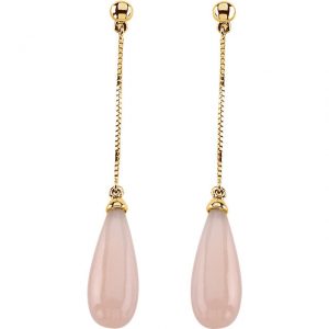
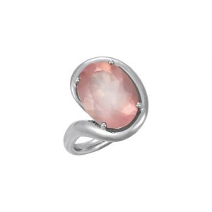
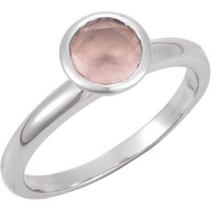
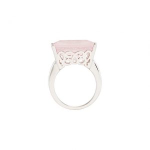
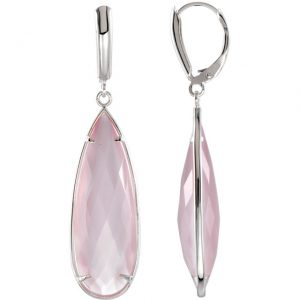
Rose Quartz, is a persuasive yet gentle tone that conveys compassion and a sense of composure. It feels very feminine, serene and focused. It would make for a beautiful pendant or statement ring.
As a gemstone, Rose Quartz helps keep us centered on our surroundings during the busy but free spirited spring and summer months.
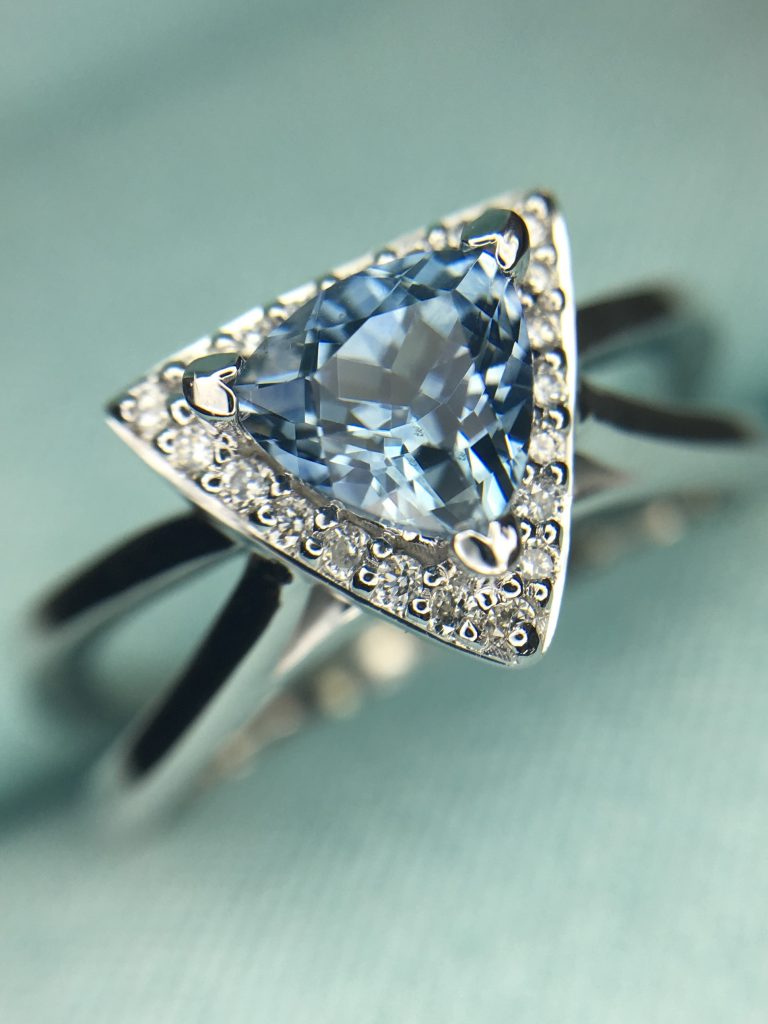
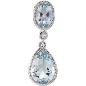
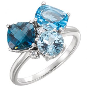
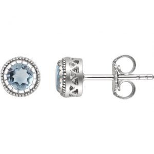
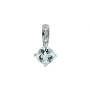
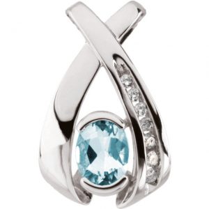
Weightless and airy, like the expanse of the blue sky above us, Serenity comforts with a calming effect, bringing a feeling of respite even in turbulent times. A transcendent blue, Serenity provides us with a naturally connected sense of space. Blue tends to bring a sense of comfort and tranquility to mind, and this transcendent version evokes feelings of strong connectedness within our space.
As consumers seek mindfulness and well-being as an antidote to modern day stresses, welcoming colors that psychologically fulfill our yearning for reassurance and security are becoming more prominent.
A symbolic color selection that work well together and a color snapshot of what we see taking place in our culture that serves as an expression of a mood and an attitude.
Joined together, Rose Quartz and Serenity demonstrate an inherent balance between a warmer embracing rose tone and the cooler tranquil blue, reflecting connection and wellness as well as a soothing sense of order and peace.
Who is Pantone?
According to their website: Pantone LLC, is a wholly owned subsidiary of X-Rite, Incorporated, is the world-renowned authority on color and provider of color systems and leading technology for the selection and accurate communication of color across a variety of industries.
The PANTONE® name is known worldwide as the standard language for color communication from designer to manufacturer to retailer to customer.
* * * * * *
Happy 2016 from Gold Market Diamond Jewelers!

